Showing posts with label Market trend. Show all posts

Thursday, December 7, 2017

One Of Bank of America"s "Guaranteed Bear Market" Indicators Was Just Triggered

It is undisputed that the last 2 quarters have demonstrated an impressive jump in corporate earnings growth, if mostly due to a beneficial base effect from plunging 2016 earnings which pushed them below levels reached in 2014. And naturally, this rebound has been more than priced into a market which has seen substantial multiple expansion since the Trump election to boot. But what is much more important for the market is what corporate earnings look like in the future, and it is here that Bank of America has just raised a very troubling red flag.


According to BofA"s Savita Subramanian, in November the S&P 500"s three-month earnings estimate revision ratio (ERR) fell for the fourth consecutive month to 0.99 (from 1.03), indicating that for the first time in seven months, there were more negative than positive earnings revisions, needless to say a major negative inflection point in the recent surge in profits. The bank"s more volatile one-month ERR also weakened to 0.94 (from 1.16).


A breakdown of EER by sector showed a sudden and broad-based deterioration, as the three-month ERR weakened across eight of the 11 sectors, with Materials, Health Care, and Financials seeing the biggest declines while, not surprisingly, Tech and Energy have the highest three-month ERRs, with Energy"s ERR expanding the most on the back of rallying oil prices. Meanwhile, Telecom, Real Estate, and Discretionary have the weakest ratios, and November saw a drop in the Health Care and Industrials" EER ratio below 1.0 (meaning more cuts than raises to earnings forecasts) for the first time since March. Furthermore, while two sectors have been "improving" in recent months: namely Energy and Tech whose ERRs have been rising; all other sectors have seen their ERRs roll over.


Why is this significant?


As BofA explains, the three-month S&P 500 ERR is used by the bank as one of its 19 key "bear market signposts", and with the one-month ERR falling below 1.0 for the second time in six months, this marks the trigger for the 11th bear market signpost. BofA"s ERR rule is triggered when, over a six-month window, all of the following criteria are met: 1) the one-month ERR falls from above 1.0 to below 1.0; 2) the one-month ERR is below 1.0 for two or more months; and 3) the three-month ERR falls below 1.1 for at least one month.


Incidentaqlly, the hit rate of the "ERR" bear market indicator, meaning its historical accuracy in predicting a bear market is 100%, the only question is how long it takes. The last time this trigger was set was mid-2003, and here is the punchline from Bank of America:


Since 1986, a bear market has followed each time that the ERR rule has been triggered. While individual signposts may not be useful for market timing (this one was triggered several years too early in the last two cycles), prior bear markets were preceded by a broader array of signals having been triggered.


This is shown in the chart below:


Ok so one indicator out of 19 now is flashing "bear market" dead ahead. That"s hardly bad if the rest are all green, right? Well, they aren"t.


As discussed two weeks ago, Bank of America recently compiled a list of bear market signposts that have always occurred ahead of bear markets. No single indicator is perfect, and as Subramanian wrote, "in this cycle, several will undoubtedly lag or not occur at all." And while single indicators may not be useful for market timing, they can be viewed as conservative preconditions for a bear market. In this context, the suddenly "triggered" ERR indicator is one of the bank"s 19 bear market signposts.


Here a caveat is warranted: in the last two cycles, the ERR rule was triggered several years too early (Chart 3 above), although a bear market followed each time that the ERR rule has been triggered. As for timing, the more signposts triggered, the greater the risk of an imminent bear market, in BofA"s view. And in November, the one-month ERR falling below 1.0 for the second time in six month marked the 11th trigger (out of 19). This is shown in the table below.


It also means that nearly two-thirds of Bank of America"s bear market indicators have now been triggered. As Subramanian concludes "every cycle is different, but we expect to see more signposts triggered before the eventual market peak."


Then again, this remains a "market" where even if 12 out of the 11 indicators are triggered, it may just send the S&P limit up as there is no point in selling if all that does is guarantee another central bank bailout.


Record Calm Stock Market Gets A Shock

Via Dana Lyons" Tumblr,


After a record run of muted movement, will recent volatility send negative shock waves through stock market?


The recent uptick in stock volatility has some investors on edge (OK, it is mostly just financial news editors on edge). The truth is, while volatility over the past week has seen an increase, it is not all that far away from the historical norm. Last Thursday through Monday, for example, the Dow Jones Industrial Average (DJIA) experienced 3 straight “volatile” days, with daily ranges of between 1% and 1.6% on all 3 days. Looking historically, however, we find that the average daily range in the DJIA over the last 90 years is 1.6%. Even during the current bull market since 2009, the average range is 1.08%. Thus, the recent action should hardly be characterized as volatile.


The reason it perhaps seems so tumultuous is because we are emerging from a long stretch of calm in the market – record calm, at that. Prior to Thursday, the DJIA had gone 72 days without experiencing a daily range as wide as 1%. If that sounds like a long stretch, it’s because it is a record. In fact, the record prior to this recent streak was just 49 days in a run that ended in late February of this year. And prior to 2016, the record going back to 1928, according to our database, was a mere 32-day streak back in 1944 – less than half the recent streak.


Furthermore, historically, there have been just 16 streaks that have lasted as long as 21 days, i.e., 1 month.


image


Interestingly, this recent streak is the first of any of the 16 that saw 3 straight 1% daily ranges immediately following its culmination. So is mean-reversion starting to rear its volatile head here following the record calm? And is there a nefarious message to the sudden uptick in volatility?


*  *   *


If you’re interested in the “all-access” version of our charts and research, please check out The Lyons Share. Find out what we’re investing in, when we’re getting in – and when we’re getting out. Considering that we may well be entering an investment environment tailor made for our active, risk-managed approach, there has never been a better time to reap the benefits of this service. Thanks for reading!


Sunday, November 19, 2017

The "Junkie" Market Is Back

Via Dana Lyons" Tumblr,


The past few days have seen a reversal from substantial net New lows to substantial net New highs – a condition that has preceded poor performance in the past.


We’ve posted several pieces in the past regarding what we’ve termed “Junkie Markets” – junctures characterized by a substantial number of both New 52-Week Highs and New 52-Week Lows.


Such conditions represent a key component of various and notorious market warning signals, such as the Hindenburg Omen and others. As the ominous sounding names would imply, the historical stock market performance following such signals has been poor. We have found the same to be true with respect to our “Junkie Markets”. Today’s Chart Of The Day deals with a new variation of the Junkie Market.


Specifically, we have seen an unusual development over the past 2 days. On Wednesday, the number of net New Lows on the NYSE, i.e., New Lows minus New Highs, exceeded 2% of all exchange issues, a fairly large amount. The very next day, yesterday, conditions completely reversed as we saw net New NYSE Highs, i.e. New Highs minus New Lows, actually account for more than 2% of all issues. If you think that sounds strange, you’re correct. It is just the 15th such occurrence since the start of our data in 1970.


image


Here are the dates of these reversals:


3/25/1970
4/14/1972
7/11/1974
10/20/1977
1/2/2001
4/22/2004
5/11/2004
4/18/2006
6/28/2007
7/19/2007
9/19/2008
5/30/2013
10/10/2013
1/15/2015
11/16/2017


What would cause such a phenomenon? Well, the only thing we can offer is that a Junkie Market, i.e., one with lots of New Highs and Lows, is really the only type of market in which such a reversal is even possible. Thus, it should not be surprising that the S&P 500’s aggregate performance going forward following these precedents has been less than stellar (incidentally, aggregate performance is similar following the 19 occasions of the opposite reversals, i.e., >2% Net New Highs to >2% Net New Lows).


image


With median returns negative from 1 week to 6 months, this appears to be another version of the Junkie Market that, for whatever reason, has not been kind to stocks going forward. Obviously, the presence of signals near cyclical peaks in the early 1970’s as well as 2001 and 2007-2008 do not help the aggregate returns (average returns are even worse than median).


Now, not all signals have occurred at the beginning of cyclical bear markets. However, as the chart shows, one interesting observation is that all of the occurrences have occurred during secular bear markets (that is, of course, if one accepts that we are still within the confines of the post-2000 secular bear market, as is our view – that is a topic for another time, though). The point is that, if true, the ramifications may reinforce the negative tendencies associated with Junkie Markets.


The bottom line for now is that, while it is certainly possible that stocks can continue higher in the interim, this condition of elevated New Highs and New Lows is a potential unhealthy headwind in the longer-term.


*  *  *


If you’re interested in the “all-access” version of our charts and research, please check out The Lyons Share. Find out what we’re investing in, when we’re getting in – and when we’re getting out. Considering that we may well be entering an investment environment tailor made for our active, risk-managed approach, there has never been a better time to reap the benefits of this service. Thanks for reading!


Monday, November 13, 2017

Great Voids Have A Way Of Filling

Authored by Sven Henrich via NorthmanTrader.com,


I feel compelled to keep documenting reality to raise awareness of the ever larger market dangers which keep lurking underneath the current bubble. Indeed I keep seeing a great void not only in awareness but also in price discovery that have propelled markets to current levels leaving investors and participants ever more lulled into a false sense of security by the current unprecedented phase of volatility compression.


Take these comments as part of an ongoing journey outlining building risk factors. You can read about additional updates/background in the Macro Corner, Market Analysis , NT Blog and the Market Analysis sections of the site..


Briefly to get everyone on the same page:


Two way price discovery, as a normal part of market functioning, has practically seized to exist. I’ve pointed out charts of this nature before, but I’ll use the quarterly $DJIA chart as an example to illustrate the point:


Several points to make here:


The $DJIA is on its 9th quarter of consecutive price appreciation. The last red candle was before the now almost $5 trillion in combined global central bank intervention since February 2016.


The $DJIA, as the $SPX, is now on its 4th consecutive quarter of not reconnecting with its quarterly 5 EMA. Such an extended disconnect has never occurred in the 100 year market history I reviewed. And believe me, I’ve looked:


The few examples of extended quarterly 5EMA disconnects I could find were associated with coming market pain.


Aside from global central bank intervention (also see Liquidity Wave) the other key contributing factor to the no 2 way price discovery equation is the unprecedented influx of passive ETF investing and plenty of data exists to illustrate this point:


What has happened? I consider it retail capitulation. For years hedge funds have underperformed central bank liquidity infested market waters yet retail investors keep seeing markets go up with no downside ever and no apparent associated risk with rising multiple expansion.


The end result: Investors are completely impervious to the building risk factors and the actual price/valuations of asset prices they indirectly own.


If there is no risk to holding stocks then who cares if the underlying asset will ever grow in its valuation? Who cares if the business models don’t match up the PEG ratios?


Price targets have now simply been rendered an exercise in FOMO expectations. Indeed Wells Fargo rightfully calls it another QE effect:


“It’s very similar to QE.” Harvey said Wednesday on CNBC’s “Trading Nation.” “With QE, you took a certain part of the Treasury market out of circulation. Now what you’re doing is you’re taking a good part of the equity market out of circulation, and you’re upsetting the supply and demand dynamics. There are fewer natural sellers.”


Wells Fargo’s new 2017 forecast calls for the S&P 500 to reach 2,636, which reflects about a 1.9 percent gain from current levels. The firm started the year with a 2,475 year-end target, which would have come in about 4 percent short if the year was to end now.


We don’t see a lot of bad news in the short term, and so we feel it’s fairly justified,” said Harvey, who became in charge of the firm’s S&P 500 price target and earnings forecast in April. He acknowledges Wells Fargo’s initial forecast was “too conservative” and the year has been exceeding expectations.


According to Harvey, there’s still momentum in place for stocks to grind higher.


No one wants to be the first one out of the pool. No one wants to de-risk at this point in time,” Harvey added. “You have this mindset of FOMO — fear of missing out.”


There. FOMO. I can’t disagree that this price extension or even further extension could happen. As long as there is no consequence to overpaying for assets and volatility remaining compressed with all corrective activity having been removed from markets what is to stop prices from advancing ever more?


The answer: The Great Void.


Let me explain.


Firstly let me go back to a chart I showed back in March when I discussed The Finale Wave:


Back then I said the following:


“This is actually a pretty good trend line for bulls as it keeps rising of course, hence the later price were to get to there the higher markets may extend. The bad news: If this trend line has market relevance (as it appears to looking at its history), then it suggests the following:


$SPX broke this trend line in 2008/2009. And despite vast global central bank intervention as well as building a global debt load to the tune of over $152 trillion, markets remain below this long term trend line. It’s still technically broken.”


This still applies to this day and here’s an updated view of the chart with the added context of the multi decade declining trend in the 10 year yield:


Why is this important: It could be argued that low yields remain the theory of everything over the past 30 years as we’ve moved from one bubble to next with central banks reacting each time by dropping interest rates to “save markets”.


Take the $DAX chart I showed the other day:


Same concept.


What’s the net effect of one way price discovery? Massive, historically unprecedented technical extensions that scream danger, incompatible with the complacent attitude of investors.


Let me show you some charts that need to be seen to believed. Frankly if ETF investors were to see these charts they may get a better sense as to where in historical context they are deciding to invest long in these markets.


Hence my quest to raise awareness and I use linear charts in some cases to really drive the point home. Linear charts make ZERO difference in regards to moving average disconnects or fibonacci retrace levels, but they can help illustrate the vastness of the void. Indeed log charts can breed a sense of complacency as often price does not appear anywhere near as extreme.


On this latter point let me give you 2 examples of two very successful companies using log charts:


$FB:


A very steady uptrend following trend lines very diligently with tags producing either rejections or bounces. The stock has had no real correction in almost 2 years. The fib levels outline the size of the corrective opportunity were markets to get shaken out of their current lull.


$GOOGL shows a similar picture:


An ever narrowing channel showing a void of any corrective activity of size.


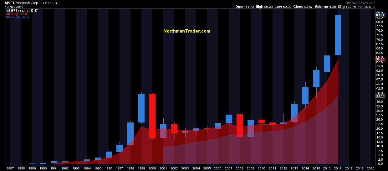
Now let’s get to the great awakening. I’m showing you a few examples of individual large cap stocks on yearly charts in relation to basic moving averages. Note the regular proximity to the annual 5 EMA in particular.


Now look at 2017. THIS is where investors are passively adding money to markets.


How do these things end? Can these things end? Look no further to $GE to give an imminent sense of risk:


Reconnects are coming. They always do and just because markets get stretched to extreme levels it does not mean reconnects are not coming.


These disconnects have been brought to you by one way price discovery. “No natural sellers” Wells Fargo calls it. That’s right. No sellers. Markets have buyers AND sellers. If there are no sellers you don’t have a market.


No sellers means no volatility. And the extremity of the volatility compression is highlighted in its inverted product the $XIV:


On the $VIX itself all regular spikes to the weekly 500MA have been eliminated 2017. For now.


History suggests that this state will not be able to sustain itself:


2017 has shown that extreme markets can become more extreme. There is nothing new about that. We’ve seen it famously in 2000.


Extreme markets do not imply future performance. But hey help inform risk/reward.


Whether we continue to extend price discovery in a one way fashion into year end I can’t say. What I can say with affirmation is that investors appear utter oblivious as to the historic and technical context in which they allocate cash to the long side.


One way price discovery, volatility compression and over 8 years of central bank intervention has paved the way to a general attitude that investors can’t lose money being long. Price will always come back. Not only in our life times, but these days every day as no downside ever last more than a few minutes. No natural sellers.


This will change.


And it’s critical for investors to keep an eye on possible signs of change, even subtle signs. I offered some not so subtle signs in Caution Slowdown. But macro signals can take a long time to play out in a market void of any apparent negative triggers.


Friday’s first $VIX close above 10 in 8 weeks may not amount to anything, but then it may also offer a subtle sign that change is perhaps closer than we think:


Yes the 200MA is now down to a pitiful 11.14, but the weekly close puts it above it. For the first time in a very long time.


Great Voids have a way of filling. Perhaps not in space, but here on earth they generally do. It’s just a matter of time. Remember: Tops are processes.


Friday, October 13, 2017

JPM Short Circuits & Banks Bump Up Into a Glass Ceiling as Semis Soar, Bitcoin Blasts & Block-Brain'd Sir Jamie Eats Crypto Crow

JP Morgan (JPM)


Having notched an all-time high by closing at 97.35 on 10/3, JPM appeared to be consolidating over the next 6 sessions - in preparation for another surge higher. But 10/12’s Q3 earnings release session suggests that immediate bullish momentum may have been exhausted and, with it, Sir Jamie’s next (ever-so-lovable and antithetically Populist) all-time high “I’m richer than you” quip has been - akin to PM Jordan"s Bitcoin prop traders - placed in limbic limbo.


With the close of the 10/12 session, JPM:


  1. registered a bearish engulfing daily candlestick pattern;

  2. on heavy volume;

  3. after a rally, sideways chop, and doji on the previous daily bar.

This is short-term bearish. JPM’s 10/12 session, also: 


  1. registered the largest daily volume since 7/14; and

  2. exhibited the largest daily trading range since 9/7 – the swing low that preceded this 10+% rally.

Technically speaking, JP Morgan"s 10/12 session was unabashedly bearish.


But being just shy of an all-time high …


and without a confluence of technical signals to suggest a significant inflection to the down ..


pre-emptive calls for a top in JPM"s price action should be met with a great grain of salt.


What is JP Morgan’s bottom line?  All-time highs (ATHs) beget more all-time highs.


Even if you are a PM Jordan bear (for #SirJamie"sGeniusDaughter or other non-technical reasons), you should not position for a substantial price inflection, prior to:


  1. an upside retest, where JPM fails to register a new high; and, then

  2. a breakdown that closes below the preceding 9/7 swing low of 88.08.

JPM’s strongest support (and 1st downside target) surrounds round number 94, where a small open gap remains unfilled. Should John Pierpont slump (and close) below 94, strong support levels will show themselves just above 90 and 88.


bearish engulfing jpm daily


elite oscillator jpm daily  


VanEck Vectors Semiconductor ETF (SMH)


The daily chart of VanEck’ Semiconductor ETF (SMH) clearly - and unmistakably - shows a Super MACD, Super RSI, and Super Stochastics that have each zoomed up, up, and away – into dynamic overbought territory. This confluence of technical developments is noteworthy because our Dynamic OB/OS Levels (DOBOS™) adapt to price action, rather than simply remaining static. This results in indicator value levels that often prove much stricter than the pre-set values that your ‘textbook’ suggests (and discount broker pre-populates); i.e. a stock RSI setting of 70/30, Stochastics at 80/20.


The last time the SMH daily chart exhibited Super MACD, Super RSI and Super Stochastics readings with such elevated values (~ all swimming deep in overbought waters) was just prior to the 6/8 semiconductor swing high top. And for good measure, the last time these 3 Indicators were oversold in unison was at SMH"s 4/17 and 7/3 swing low bottoms.


While a sample size of just ‘3’ instances is not statistically significant .... 


that the Super MACD, Super RSI, and Super Stochastics have all drifted into dynamically overbought territory ...


while price has paused in place, after a relatively relentless move higher without so much as a single sizable dip ..


ought give Semi bulls good reason to tighten their stops; if they are not amenable to taking partial position profits here and now (now that their winner has ran, and ran and ran so).


Semi"s bottom line?


A downside retracement for SMH would pause first around 93; then dead-cat bounce back above 94 ½ before testing round number 90 on the down. Should such a simple ABC downward retrace occur, technicians would be wise to pay particular attention to the character of price action - i.e. "how" it responds - upon dipping down into the strong lateral support shelf that spans 89 – 90.


super rsi macd stochastics smh daily


Chicago Mercantile Exchange’s Real-Time Bitcoin Index ($BRTI)


Despite a well-defined penchant for monstrous rallies, Bitcoin’s 60-minute chart shows that it entered into overbought territory on 10/12 on both the Super RSI and Super MACD. Employing Dynamic OB/OS Levels that adapt to price action allows users to acurarately gauge when price is truly exhausted and likely about to correct | reverse. 


The last time that Bitcoin ($BRTI) witnessed the Super RSI and Super MACD above their Dynamic OverBought Levels was back on 9/18, at the $4,112 high – the last hurrah of a swing high, directly before a downward correction that ended four days and -14.4% later at $3,520.


If Bitcoin is ready to take a well-deserved breather next week, support will not come into play until $4,800. And while a circa 15% downswing (after a 15%+ up day!) will not phase those who are HODLing, our central aim as market technicians is to identify and diagnose asymmetric risk:reward technical setups; so that, as traders, we can most effectively execute entries | exits and efficiently manage those positions.


To wit, a pullback that successfully finds support at and rounds back up from the $4,800 - $4,900 zone (~ the 10/12 breakout zone) would be a fine spot to enter or further build upon an existing position (with a clearly defined stop just above $4,700, to explicitly define position risk).


fibozachi super rsi macd bitcoin 60 minute


fibozachi super rsi macd bitcoin 60 minute previous


KBW Nasdaq Bank Index (BKX)


Similar in technical profile to Semis (SMH), the Nasdaq Bank Index" daily chart shows a Super RSI and Super Stochastics that are both above their Dynamic OverBought Levels. Coupled with the first flash of a daily sell signal since the 99.77 BKX swing high of 3/1, we would be very leery of getting too far out over our Nasdaq Bank Index’ skis if long BKX here.


BKX bottom line:


much like Banks" NIM not moving higher .. while price action may push yet a touch higher (c. 101-103), BKX bulls should remain on high alert with respect to the unfilled gap at 97.27; and, if BKX closes anywhere under 96, then their focus ought immediately shift to the Bank Index’ baby gap at 93.81.


fibozachi super rsi bkx daily


elite oscillator bkx daily


Happy Friday the 13th, fellow MindHunters!


For more technical analysis:


NFLX Won"t Chill: Where to Next


FX Technicals: Is the US Dollar"s Down Done?


Learn The Rules Like a Pro, So You Can Break Them Like an Artist 


Check out Fibozachi.com to learn about modern technical analysis and trading indicators that actually work. 

Friday, October 6, 2017

The Gold Bull Market and Who Needs a Method If You Can't Pull the Trigger

Visit Full Archives at The Entry Points:


This post is not meant to be a short-term timing tool (that discussion is there, but unimportant for most people), but a way to understand sentiment. The PMs are a very emotional market. It is very dangerous to get bullish with the crowd on the big rallies. The selloffs quickly ramp up the bearish sentiment. The post below was written a long time ago, and is re-posted into all of the big selling waves in gold. Sentiment shifts/crowd behavior never changes. Confidence rallies with price, and drops with price. On 9/11/17, I re-posted some wildly bullish articles around the internet about gold regarding the “bullish trendline breakouts, new highs, being above (useless) moving averages, and a potential pause in rate increases”. Now we’re starting to see the opposite – “failed breakouts, interest rate increases, monthly reversals,and being below (useless) moving averages”. There continues to be widespread ridiculous commentary about how interest rate increases and “real” interest rates are supposedly bearish for gold – here is a post debunking those views. Gold hit its secular bottom two days after the first Fed rate increase in nine years, and  has rallied substantially along with the rates, yet people still don’t get it.


The original post is below. Keep in mind it was last updated on 7/9/17, so the dates are relative to then. But the general sentiment commentary can be for any time, any week, any month. Yes, gold is in a secular bull market, and the juniors are closing in on a true bull market:


———————————————————————————————————


Gold is in a bull market, but it’s still under the influence of an accumulation area, meaning more volatility – opportunity. The true uptrend "breakout" is coming this year. The secular bottom was in December 2015 , and I stuck my neck out and bought gold even with the worldwide ultra-bearish view of PMs then – and wrote a post on 12/9/15 discussing why it was finally time to buy gold, and especially the miners. We’re up substantially from those lows. But far too many people gain tremendous confidence, become complacent, and fear “missing the move” in an uptrend, right at the worst times to get confident, after/into a big rally, (around the highs). And far too many people lose confidence in an overall uptrend/bull market right at the worst times to lose their resolve, after/into a selling wave (around the lows) – opportunity. That confidence and fear of missing the move (at the worst time) just happened into the 6/6/17 highs, when there were numerous calls for a “trendline breakout”. My view was the opposite, and used the recent selling, and “bullish jobs number” to buy.


In a bull market the big scary reactions are the time to use our emotions in our favor, by using reverse psychology on ourselves. Is it easy? No it’s not. But if you’re feeling scared, gloomy, and can’t imagine there could be a bottom setting up, then so is everyone else. And these lows are also at the same time that most of the market shorts are getting super confident (weak hands). Which is just like how most of the market longs get super confident right into the highs (weak hands), as per the second week of February in the miners. So it’s in the big selloffs when we need to pretty much put the charts aside and step up to the plate. Because who cares what the charts look like if we allow our emotions to rule.


Complex methods are useless for almost everyone, especially myself. Because 75% (or whatever number, you get the point) of this business is about psychology – meaning our own psychology, and also being able to interpret, pretty well, everyone else’s (the crowd’s) psychology. This may sound weird, but instead of spending so much time learning a “method”, you may want to spend time truly understanding your own strengths and, especially, weaknesses. And also learn about the psychology of the crowd. Two outstanding books to help learn crowd psychology are “Nobody Knows Anything” by Bob Moriarty and “Extraordinary Popular Delusions and The Madness of Crowds” by Charles MacKay. In the bigger picture, understanding our psychological/emotional makeup, as well as that of the crowd, is much more beneficial than being tied to a method. But if we can mesh our newfound understanding of psychology with a solid method, then that is a pretty powerful approach. And actually, it’s the approach to markets which is the most important thing. Who cares what the method is if we can’t pull the trigger (unemotionally) at the “best” entry points?


It happens time and time again. People have all of their great looking charts with their fancy moving averages, support areas, and trendlines. These charts look great when prices are in a sustained move higher. The moving averages all “say” buy, buy, buy. The support areas are “holding”, and the trendlines are slanting up, up, up. People look at charts then and see things “are looking good”. Who wouldn’t be confident? And the only ones with pain at that point are the shorts, plus the people who were too afraid to buy into the previous fear-based selling, thus these folks are “missing the move”. Missing the move can be as painful for many as losing is for other people. Then the selloff starts, and the confident longs wish they’d sold. But they look around the internet for the GURUS (who were bearish at the bottom), to give them reassurance. And the selloff deepens, and the mood changes. and the charts look horrible – support areas get broken, trendlines get broken, and moving averages are all pointing down. In short, the charts look horrible, and the vast majority of people, who are tied to their charts, get as bearish as everyone else – so they freeze. And then, once again, they do nothing right at the potentially best entry points into markets.


Markets haven’t changed since the Tulip Mania. Meaning ninety percent of the people will never be able to pull the trigger at the best entry points, and are too confident to sell into the greed. Don’t be one of them.

Tuesday, October 3, 2017

Homebuilder Stocks Surge To Bubble Highs, There's Just One Thing...

A key index of housing stocks has finally made it back to the highs of last decade’s bubble.


As Dana Lyons explains, one of the, in some ways surprising, achievements of the current bull market in stocks has been its ability to resuscitate former busted bubble sectors once left for dead. For example, early this year we saw the Nasdaq 100 finally break decisively above its dotcom-laden bubble top of 2000. This year has also seen a resurgence in bank stocks, with the dead cats jumping off the financial crisis mat to within spitting distance of their pre-crisis levels. And in this latest rally, we are seeing another former bubble poster child building its way back up to its former highs — housing stocks.


In fact, at the end of last week, the benchmark PHLX Housing Sector Index (HGX) made its way all the way back to its 2005 bubble top for the first time in a dozen years.


So golf claps and trivial tidbits aside, what are the investment ramifications of this achievement for housing stocks? Will the HGX prices have “memory” here near their 2005 highs and provide resistance? Or are 2005’s prices ancient history with no relevance given a wholly different fundamental backdrop for the sector?


Obviously no one has the answers to those questions, including us. I will say that the HGX’s recent breakout above the July-August highs and subsequent follow through has been impressive and the momentum may carry the index further.


However, I will also caution against dismissing the notion of price memory (in the form of resistance) stemming from the 2005 highs. Non-technicians and chartists may scoff at the possibility, but such major junctures on a chart can have a significant impact, even a dozen or more years later. Consider that the Nasdaq first encountered its 2000 highs in mid-2015. It took a full year and a half — and a bumpy one at that — before the index was able to sustain a move to new highs.


So while this rally in housing stocks may have further room to run in the near-term, don’t be surprised if the stocks’ charts are eventually forced to re-build.


So we are back to the bubble highs from 2005 for housing stocks - which proved to be of no signaling potential for the future then - and this time, there"s a little snag too. US housing data has been a disaster in recent months (and don"t blame the storms, NAR isn"t) as affordability crushes the American Dream on a river of One-Percenter-Buy-to-Rent liquidity...


*  *  *


If you’re interested in the “all-access” version of Dana"s charts and research, please check his new site, The Lyons Share.

Monday, September 25, 2017

Two Key Indicators Show The S&P 500 Becoming The New "Cash"

Authored by Daniel Nevins via FFWiley.com,


Pension plan administrators do it. Their actuaries and consultants do it. Professional endowment and foundation investors do it. Financial advisors do it. Private investors may or may not do it, but they probably should.


Do what?


All of these folks already are or should be asking themselves the following question: What’s a reasonable expectation for the long-term return on a broad-market equity investment?


Professionals usually answer the question using complex models, and there’s nothing wrong with that, but we’ll keep it simple here. Simple often beats the snot out of a long white paper, and two recent developments beg for simple.


First, on Thursday the Fed released its flow-of-funds data, which includes an estimate for the household sector’s overall asset allocation. Data show allocations to corporate equities reaching 25.1% of total household (and nonprofit) assets, a level only before seen between Q4 1998 and Q3 2000. Here’s the full history:


spy returns chart 1


Now, you may say 25% is just a number, and we would agree, but only to a point. We don’t think the household sector’s current allocations tell us anything about the market’s near-term direction. In fact, we don’t detect any of the most common precursors to major market turning points, as discussed here.


But we do think household equity allocations offer clues to long-term returns. Consider the next chart, which compares the allocation data to the corresponding S&P 500 returns over subsequent periods of six, eight and ten years:


spy returns chart 2


You’ll decide for yourself, of course, how to interpret the chart, but we’ll entertain three possibilities.


First, you might rely on a few instances in which S&P 500 returns reached almost 4% after the equity allocation was 25% or more. Compared to today’s miniscule bond yields, 4% looks respectable. If stocks do, indeed, return 4% over the next six to ten years, that could be higher than the return on any other major asset class, which probably explains how stocks got so expensive in the first place.


Second, you might mentally project the scatter plot’s downward trend out to the current equity allocation. Doing that, returns appear to spread evenly around today’s cash rate of about 1%. So, whereas optimistically you might expect a return of 4% or thereabouts, more realistically a negative return is almost as likely.


Third, you might look at the data and say, “So what? We should really use a traditional indicator - one that compares prices to earnings - not an asset allocation measure.”


Which brings us to another recent development that might alter future returns—the S&P 500 busting through 2500. To account for that latest market milestone, the next chart updates one of our favorite S&P 500 indicators, the price–to–peak earnings multiple or P/PE. (Unlike a standard price-to-earnings multiple that places the past year’s earnings in the denominator, P/PE uses the highest four-quarter earnings to date, mitigating distortions that occur when earnings fall in recessions.)


spy returns chart 3


At a price–to–peak earnings multiple of 23.6, we’re currently at about the same valuation as in December 1997. Once again, you might find an optimistic interpretation - that is, the long bull market that finally ended in 2000 suggests there could still be room to bubble up from here. But the implications for long-term returns aren’t nearly as optimistic, as shown in our final chart:


spy returns chart 4


If you stare at the chart long enough, you might see a less bearish picture than in the first scatter plot above. (Stare even longer and you might see the King of France.) But the difference isn’t especially large. On either chart, the downward slope points to a meager long-term return. In fact, if we use only the scatter plots above to make our estimate, while also accounting for the Fed’s predicted interest rate path, the S&P 500 appears to offer a similar return to cash.


Conclusions


To be clear, we’re encouraging long-term bulls to reconsider their assumptions, but we’re not advising them to dismantle carefully diversified portfolios (meaning those that are spread sensibly among multiple asset classes). We would be more likely to recommend a major portfolio shift if the usual bear-market catalysts - sharply rising inflation, high interest rates and poor credit conditions - were present.


More to the point, it seems a good time for investors to check their expectations and risk levels. Investors should develop reasonable expectations informed by data such as those in the scatter plots above. And they shouldn’t take more risk than they’ll be able to tolerate as the next bear market plays out. As always, only a small percentage of investors will accurately time the next market cycle, and we shouldn’t bet too heavily on being among those fortunate few